The majority of my work over the last 2 years has been in the area of product analytics. I've been fortunate enough to work with a wide range of businesses with widely different products serving both the business and consumer markets.
During this time there was a heavy focus on retention but I was able to learn new ways to help my clients gain valuable insights from their product data outside of the traditional retention metrics.
In this post I'm going to cover 6 ideas that you can you can use to enhance your product analytics.
Use period cohorts and filters to eliminate noise
If you're working for a very early stage company (1 - 3 years old) then there is a good chance your data is extremely noisy.
Your product might have started out as an MVP or perhaps it's been through a complete rebuild or pivot. Perhaps you launched to a specific geography as a pilot and now you're globally accessibly. Whatever the history of your application it can help to look at your data in slices based on historical periods.
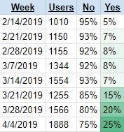
Look at the screenshot below. Assume it's showing you the % of users which did your key action by user registration week (cohort). You can see that since the week of the 21st March 2019 the percentage of users doing your key action has dramatically increased (and continues to rise).

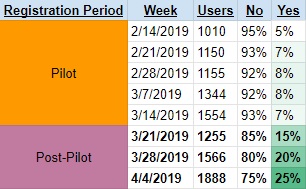
The issue with the table above is that there is no context. Now look at the screenshot below and notice the difference.

The screenshot above now includes an additional slicer, "Registration Period". The table now has context and everyone that views this table will have a better chance of understanding why the "Yes" percentage shot up so dramatically.
If you've decided to include period cohorts in your reports and dashboards, it only makes sense to include filters ("slicers" in the case of Excel) so consumers can focus on the relevant cohort groupings.
Period filters are especially helpful for eliminating noise in bubble charts, line graphs and cohort tables with many rows.
As your company matures, you'll be able to eliminate old cohort periods entirely from your analyses and data visualizations.
If you have high variance you should be focusing on infrastructure and processes
The best painter in the world still needs a brush and paint to create a masterpiece. If your company's data looks like a roller coaster your hands will be tied.
An analyst simply can't proactively provide useful insights from data trends which are changing radically from period to period. In fact a company which has very high variance in their product data will typically be either very early in their history, or struggling to reach product market fit.
The marketing department can also indirectly cause high variance in your data because of big changes in spending, or the nature and scale of their campaigns.
If you're an analyst in such a position then you should focus a higher percentage of your energy on the quality of the BI infrastructure and businesses processes. For a detailed list of ideas I'd recommend reading my post, "The Ultimate Guide to Saving Your Startup Millions of Dollars in 2019" and focus on the sections that reference business operations and tools.
Make sure you've nailed your core funnels
Almost every successful tech company has very basic high-level funnels. Lets look at some examples:

New User Funnel: Complete registration --> Confirm email --> Connect with 7 friends
Onboarded User: Visit the site --> Engage (includes likes, shares, join event, creating posts)

New User Funnel: Complete registration --> Confirm email --> Follow X people --> Send first tweet
Onboarded User: Visit the site --> Follow someone OR send tweet

New User Funnel: Download the app --> Add credit card --> Request an Uber
Onboarded User: Open the app --> Request an Uber
I bet if I had to ask you to guess the core funnels of Facebook, Twitter and Uber you would have got close to what I wrote above. These companies nailed their core funnels a long time ago and now work tirelessly to optimize them.
Many companies I talk to have yet to work out their core funnels and are in many ways stuck chasing their tails. The head of product (usually one of the founders in the early days) is responsible for mapping out the core funnels of the company. As the data specialist in your company, it's your responsibility to make sure the company can measure these funnels.
This funnel should be represented in a dashboard, preferably as a cohort, so it can be monitored frequently.
Focus on the outliers
I'm a big fan of bubble charts. Not only do they look nice but they work wonders for helping to identify outliers.
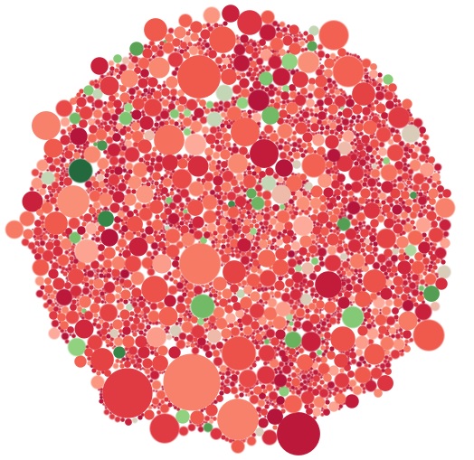
The screenshot below shows a bubble chart of orders with the size representing profit and the color representing the quantity of products sold in the order. The greener the circle the more items that were sold in the order.
This bubble chart makes it really easy to identify outliers across 2 dimensions, profit and profit / items sold. If you want to identify highly profitable orders you'll focus on the large circles. If you want highly profitable orders with many items sold, you'll focus on the big green circles.

In most cases I end up building a bubble chart for my clients which shows users. This view is very valuable to all departments since each team will want to focus on outliers for different reasons.
I set up the dashboard view to allow users to dynamically change the dimensions used in the size and color scales so dozens of different angles can be viewed. The product team will want to focus on usage while the marketing team may want to focus on demographics, virality or LTV.
Map it easy to analyze the behavior of individuals
If you've made it easy for consumers in your company to identify outliers within your user base, the next step is to make it easy for them to view the behavior of those outliers.
If you've set up event tracking with a tool like Segment then you'll be able to display the historical behavior of a specific user to your consumers.
There are a few ways to achieve this goal from leveraging tools like Mixpanel, to setting up dynamic views in a tool like Tableau.
If you have technical and data-driven consumers which are Tableau power users then you may want to consider using a bubble chart + bar / table views with the help of action filters.
Automate the collection of user feedback
I can't emphasize the importance of user feedback enough. I've covered this topic before (here and here) and will continue to push it's importance, especially for early stage companies.
As a product analyst you should make sure you're prioritizing the collecting of user feedback. There are many useful tools which can be used to set up automated flows which will help you gather valuable insights.
My favorite tools include:
- Intercom
- Data-driven, auto-emailing solutions like Vero and Customer.io
- Marketing automation tools like HubSpot and Marketo
- TypeForm (embed in product or use with email tool)
- Qualaroo
If you're using any of the tools above then make sure you have at least one automation in place which has a wide reach.
Some other ideas for collecting more user feedback:
- Ask the user for feedback as part of your onboarding email flow (preferably towards the end of the email series).
- Prompt users to provide feedback at strategic points in their lifecycle, like for example after renewing their subscription, or after reaching a major milestone.
- Set up outlier segmentations in your email delivery solution (something like Vero, HubSpot or Customer.io) which receive emails asking to set up an exploratory call. A tool like Calendly is great for removing friction.
Summary
The world of product analytics is vast riddled with all sorts of challenges. As a product analyst your job is to operate in this world and do what you can to help your company succeed.
I hope the tips I've shared in this post help show that product analytics doesn't stop at retention and "daily active users". You need to be strategic, creative and vigilant.
Here's to the product analysts, may your variance be low and your retention high.


