I've had the opportunity to use dozens of tools during my career. Few products have impressed me as much as Tableau.
In this post I'm going answer the question, what exactly is Tableau? My secondary goal for this post is to give you the info you need to get started using the tool.
Let's get started.
What is Tableau?
Tableau is a publicly traded company which builds data visualization and analysis software for businesses. Tableau is used by companies as large as Adobe and Dell and boasts over 50,000 customers. Tableau's market cap at the time of publication was almost 9.5 billion dollars.
Tableau has 3 main products, Tableau Desktop, Tableau Online and Tableau Server. These products work together beautifully to provide the entire data visualization needs of the organization.
Introduction to Tableau Desktop
Tableau Desktop is the most relevant Tableau product for analysts. Tableau Desktop is the product you'll use to analyze your data and build your data visualizations.
I like to think of Tableau Desktop like Photoshop. It is a relatively large piece of software which you'll need to download onto your local computer in order to use it. Similar to how you'd use Photoshop to create psd files, you'll use Tableau Desktop to create workbook files (twb files).
You can find the download page for Tableau Desktop here.
One cool thing about Tableau Desktop is that you can download it and use it for free for 14 days.
Tableau recently changed their pricing so now Tableau Desktop is bundled with one Tableau Online license. The bundle costs $70 a month, paid upfront for the year.
What is a workbook?
A workbook is a container of one or more sheets, dashboards or stories that you'll create using Tableau Desktop.
A sheet is the most basic type of container. A dashboard is a special container which allows you to place one or more sheets, and accompanying filters and parameters, in a single view.
A story is a special type of container. A story allows you to place sheets or dashboards in a sequence, similar to how slides are arranged in PowerPoint. This allows you to "tell a story" with your sheets and dashboards.
Introduction to Tableau Online and Tableau Server
Tableau Online and Tableau Server are both cloud-based services for hosting Tableau workbooks.
Both of these products make it easy for your analysts to share data visualizations with your entire organization. A single dashboard could be used by dozens of stakeholders, exponentially increasing the value of the dashboard.
If you want to use Tableau to help make your business more data-driven then you'll need to commit to using either Tableau Online or Tableau Server.
What differentiates Tableau Online from Tableau Server is the fact that Tableau Online is fully hosted by Tableau.
Advantages and disadvantages of using Tableau Online over Tableau Server
The major advantages of using Tableau Online over Tableau Server include:
- Quicker setup time
- Can be setup by a non-technical person
- No server maintenance needed
The major disadvantages of using Tableau Online over Tableau Server include:
- More expensive per license
- Your data is sitting on Tableau's servers, not your own
- Can't scale up the capabilities of the server hosting your files, in other words you're reliant on the speed of Tableau's servers to load your dashboards.
Should I use Tableau Online or Tableau Server?
For early stage companies I'd suggest starting with Tableau Online.
This is the quicker and easy option and you can always migrate over to Tableau Server. More mature organizations that want to have control over their infrastructure, or plan to scale to hundreds of consumers, should use Tableau Server
Tableau Online and Tableau Server pricing
Tableau uses a licensing model. This means that each individual that you'll want to access your dashboards, will need their own license.
At time of writing, Tableau had the following pricing:
Tableau Online
- Explorer license = $42 per license per month, billed annually (minimum of 5)
- Viewer license = $15 per license per month, billed annually (minimum of 100)
Tableau Server
- Explorer license = $35 per license per month, billed annually (minimum of 5)
- Viewer license = $12 per license per month, billed annually (minimum of 100)
The main difference between the explorer and viewer licenses is the explorer license allows for more viewing options and self-service analytics.
Learn more about Tableau's pricing here.
Introduction to Tableau Public
Tableau Public is a free hosting service by Tableau. It works similar to Tableau Online but everything you publish to your Tableau Public account is publicly accessible. It is a great service for sharing your Tableau creations with the world.
You can see an example of a Tableau Public profile here. Check out the Tableau dashboard I published to show my readers how to visualize content analytics using Google Analytics and Tableau.
Tableau tutorial for beginners
This section of the post will provide you with the knowledge you need to get started with Tableau. I will focus mainly on Tableau Desktop since this is the most important product to know as an analyst.
Recommended resources for learning the basics of Tableau
Before we jump in I've provided a list of my top recommended resources for learning Tableau. Use this list in addition to this guide to master the basics of Tableau. Note that some of the links below are affiliate links.
- Best Udemy courses
- Tableau 10 A-Z: Hands-On Tableau Training For Data Science!
- Master Course in Tableau 10 & 2018 for Business Intelligence
- YouTube Training Videos
- Get Started with Tableau NOW!
- Tips and Tricks from a Tableau Jedi
- Best books
- Practical Tableau: 100 Tips, Tutorials, and Strategies from a Tableau Zen Master
- Tableau For Dummies (For Dummies (Computer/tech))
- Recommended reading
- How to ace the Tableau Desktop Qualified Associate exam
- How to build a content analytics dashboard with Google Analytics & Tableau
- How to run cohort analyses in Excel or Tableau
Building a Tableau dashboard as a project
The process of building a dashboard in Tableau can be broken down into the following steps:
- Understand your goals
- Map out your dashboard
- Connect to your data
- Explore your data and do any necessary cleanup
- Create any needed helper columns
- Create any needed parameters
- Create any needed dynamic selector fields
- Build your visualizations
- Build your dashboard
- Style your sheets and dashboard
- QA your dashboard
- Publish
I'm going to go through each of these steps in detail. Feel free to download Tableau and follow along.
Understand your goals
This step is self explanatory. You want to understand the goals of any project before you get started. Building a Tableau dashboard is like any project, and should have the following components:
- Owner
- Start date
- Delivery date
- Main consumers / benefactors
- Goals
Some examples of goals
- Allow the VP of sales to answer the following questions without any help from an analyst
- How much income did we generate in the last 28 days?
- Which products brought us the most income in the last quarter?
- How many units of each product did we sell last month?
- Answer the question, which sales reps passed their quota each month?
- Which product features have the best activation rates?
Map out your dashboard
Once you have your goals listed, the next step is to map out your dashboard. The idea here is to get a general idea of the different sections and functionality of your dashboard.
If you're new to Tableau then start with a very basic layout of 1 or 2 views with limited functionality and over time you will be able to get more creative.
Below is a template which you can use to make your life easier.
- View 1
- Title: Sales Overview
- Goal: X
- Viz #1
- Type of viz: Table
- Columns: Sales, Units Sold, Avg Income Per Unit Sold
- Rows: Date
- Functionality
- Allow the user to filter the rows by day, week or month
- Filters
- Location
- Product
- Product Price
- Parameters needed
- Date Selector
- dynamic selector fields needed
- Date Selector Calc
- Viz #2
- ...
This part of the project could take a day or even longer, depending on the scope of the project and the availability of your consumers. You will want to involve them in this process since they will be using the dashboard.
My advice would be to start with a minimal scope so that you can roll something out quickly and focus on adoption. You don't want to spend weeks building views that no one uses.
Connecting to data
The first major step to getting started in Tableau is connecting to a data source.
At time of publication Tableau supported an impressive list of data sources including:
- Actian Matrix
- Actian Vector
- Amazon Athena
- Amazon Aurora
- Amazon EMR Hadoop Hive
- Amazon Redshift
- Anaplan
- Apache Drill
- Aster Database
- Box
- Cisco Information Server
- Cloudera Hadoop
- Denodo
- Dropbox
- EXASOL
- Firebird
- Google Analytics
- Google BigQuery
- Google Cloud SQL
- Google Sheets
- Hortonworks Hadoop Hive
- IBM BigInsights
- IBM DB2
- IBM PDA (Netezza)
- Intuit Quickbooks Online
- Intuit Quickbooks Online (9.3-2018.1)
- Kognitio
- MapR Hadoop Hive
- Marketo
- MarkLogic
- MemSQL
- Microsoft Analysis Services
- Microsoft PowerPivot
- Microsoft SQL Server
- MonetDB
- MongoDB BI Connector
- MySQL
- OData
- OneDrive
- Oracle
- Oracle Eloque
- Oracle Essbase
- Pivotal Greenplum Database
- PostgreSQL
- Presto
- Progress OpenEdge
- SalesForce
- SAP HANA
- SAP NetWeaver Business Warehouse
- SAP Sybase ASE
- SAP Sybase IQ
- ServiceNow ITSM
- SharePoint Lists
- Snowflake
- Spark SQL
- Splunk
- Teradata
- Teradata OLAP Connector
- Vertica
- ODBC databases
Tableau also supports the following file formats which can be loaded into Tableau Desktop straight from your computer:
- Microsoft Excel
- Text files
- JSON files
- Microsoft Access
- PDF files
- Spacial files
- Statistical files
Tableau also allows users to connect directly to a Tableau Online or Tableau Server account in order to leverage data sources that you've published to the cloud.
If you want to connect to a data source which doesn't appear in the list above then check out the Web Data Connector.
Below is an example of the connection screen for the MySQL data source.

Once you've successfully connected to your data source you'll be taken to the "Data Source" screen. It is in this screen where you will construct your data set.
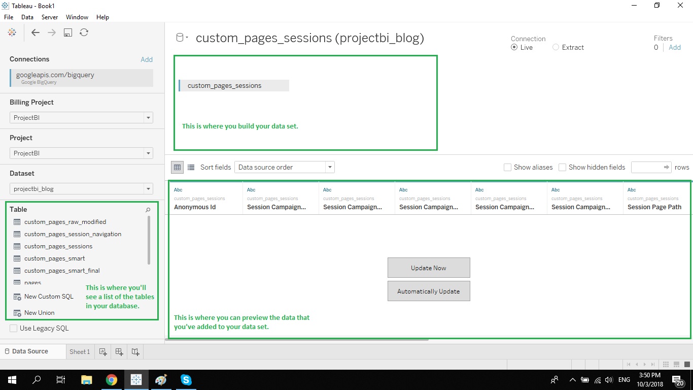
Depending on the type of data source you've connected to, you'll see a list of tables in the left hand menu. You can simply drag and drop the relevant tables into the open section towards the top of the screen.
If you only want to take specific data from one or more tables in your database, you can write a custom query. To perform this action simply drag the "New Custom SQL" option into the open area and write your query.
On the "data source" screen you can also preview your data, add filters, hide certain columns and create unions.
One of the most powerful features in Tableau is the ability to join multiple data sources to each other. This allows you to combine data from multiple data silos.
To add an entirely new data source to your data set, simply click on the "Add" button towards the top of the screen on the left hand side.

Once you've added the second data source, you can drag tables from that source into the area where you are building the data source.
How to join data sources in Tableau?
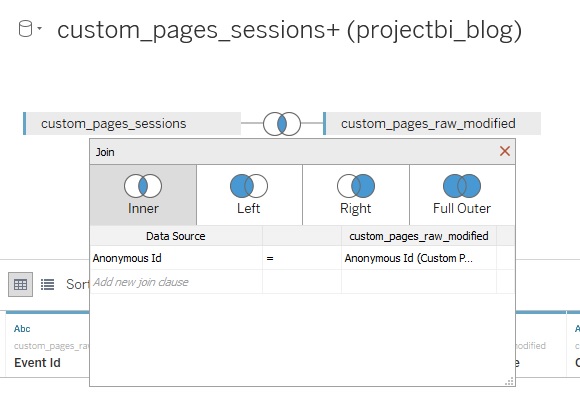
Joining numerous tables together in Tableau is very easy. Each time you drag an additional table into the building area Tableau will attempt to join the new table with the most relevant field in one of the existing tables.
In the example below Tableau identified Anonymous Id as the likely field to perform the join. To reconfigure this join all you need to do is click on the join, pick the join type, and change the fields listed between the tables.
Some tips for building data sets in Tableau:
- In some cases you may need to manually change the data type of one of the fields in your join. Tableau won't join two fields which have different data types.
- You can use one of Tableau's built in functions as part of your join. To perform this action click on the drop down menu to change the field and click on "Create Join Calculation".
- Some connectors like Google Analytics and SalesForce do not allow you to add additional data sources.
- In order to speed up the building of your dashboard try and only bring the data that you will require. The more fields you have in your data set the larger the file will be. The bigger the file, the slower everything will run.
Live vs Extract mode in Tableau
Now that you've built your data set it's time to work out if you'll need to use a live connection or an extract.
There are pros and cons to each of these modes. I've generally always favored extracts over live connections because of the speed benefits. With a live connection you're querying your data sources directly, in real time. It can take minutes for certain queries to run and it can get very frustrating very quickly.
You'll want to use live mode if you need real-time or close to real-time data. From my experience that is very rarely the case.
If you use an extract, Tableau will download a copy of the data set onto your local computer and use it while you build your dashboard. This extract can then be published to the cloud and an automatic refresh can be set.
The big disadvantage of this approach is that it can burn a lot of time having to download large data sets onto your computer. This can be particularly painful if you're in a country with poor Internet.
My advice would be to work on extract mode unless your dashboard requires up-to-date data.
Explore your data and do any necessary cleanup
Before you go any further I'd recommend that you stop and save your workbook. Tableau has a great auto-recovery feature which has saved my ass more times than I'd like to admit, but don't rely on it.
Now that you've built your data source click on "Sheet 1" at the bottom of the screen. This will take you to the sheet screen. This is the screen where you will build your first data visualization.
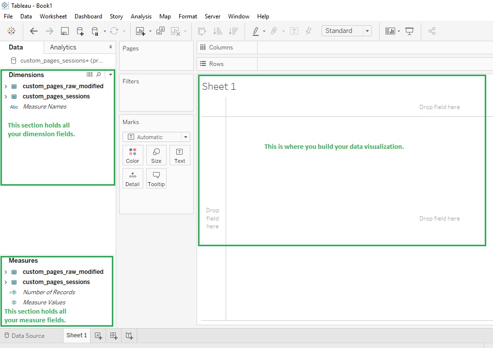
This screen has a few key sections. The first is the dimension and measures sections on the far left. This is where all the fields that you've added to your data set can be accessed.
The simplest way to understand the difference between dimensions and measures is measures are numerical fields. There are times when Tableau identifies numerical ids as dimensions. You'll see that there aren't any issues when this happens.
In my screenshot above I've highlighted the section where you'll build the data visualization.
When I first start working on a project I like to spend some time exploring the data I've brought into the workbook.
The first thing I'll typically check is the number of records. You can do this easily in Tableau by dragging the "Number of records" field into the middle section of the sheets page. This field is created automatically by Tableau Desktop. See the example below.
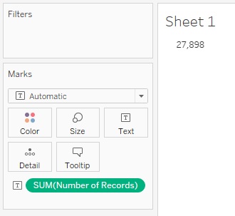
The reason I do this is to get a sense of the scale of the data in my data set. If the number seems way too low then perhaps I connected to the wrong database. If it is too large then perhaps I have duplicates because of a bad join or a data issue.
The next thing I'll typically look at is a breakdown of my data by some key dimensions. This is a good habit to form because after you've create a few sheets you'll have a better picture of your data.
After you build your data set you want to have an image in your mind of what that data set should look like. You may end up with something on the lines of "I expect to see a single row per user with a bunch of fields holding properties about these users".
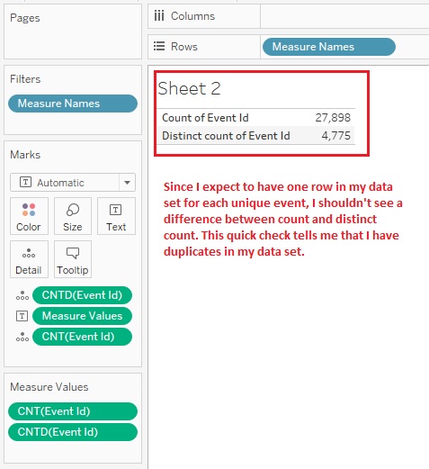
A great check to help you determine if you have the data set that you've imagined is the count vs. distinct count check.
This check compares the count of your primary id against a distinct count of that id. If you do in fact have one row per primary id then the distinct count and regular count will be the same. If there is a difference it means you have duplicates.
As you can see in my example, my data set has duplicates of my primary id, event id.
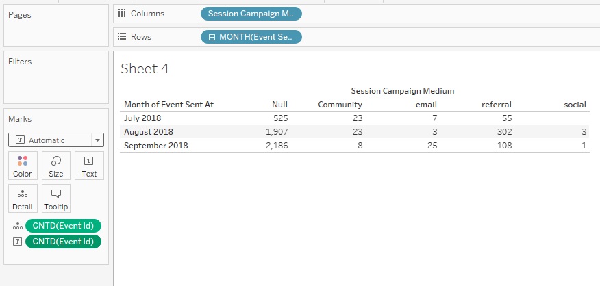
Another common check I run is a distinct count of the primary id by the main date dimension. In the case of user signups that would most likely be the signup date, as an example.
The reason this check is important is because even though you may not have duplicates or any other data issues, your data might have stopped being collected at a certain point. This check will also help you see if there were any major drops in the volume of your data in a certain time period.
Once you're confident your data is clean, and in the structure you wanted, you can move onto a new sheet and start building.
I suggest holding onto your initial check sheets in case you need to change the data set and rerun your checks. Color code these check sheets in brown so you can easily identify them as check sheets.
Create any required helper columns
One of the funnest parts of using Tableau is creating new calculated fields. You'll need to create calculated fields to fill in gaps in your data set, and in order to build complex views and functionality.
Lets say you have a data set of projects.
In this data set you have start time and end time of each project but you're missing a "duration" field. You want to add a filter to your dashboard which allows consumers to filter out projects based on duration but you're missing this field. So what do you do? The solution is to create a duration field using the "datediff" Tableau function.
The calculated field would have the following function:
datediff('day', [Start Date], [End Date])
This function would return the number of days between the start date and end date, in other words the duration of the project.
Tableau has a lot of built-in functions which are incredibly powerful.
Below is a list of the most commonly used functions. If you want to become an expert at Tableau you'll need to learn these functions.
- MIN - Returns the minimum value of an expression across all records.
- MAX - Returns the maximum value of an expression across all records.
- AVG - Returns the average value of an expression across all records.
- SUM - Returns the sum of all the values in an expression.
- COUNT - Returns the count of all values in an expression.
- COUNTD - Returns the distinct count (unique count) of all values in an expression.
- CONTAINS - Checks if a string contains a certain set of characters (does "dog" contain "og"). Returns true or false.
- DATE - Returns the date from a string.
- DATEADD - Adds an increment to a date and returns the new date.
- DATEDIFF - Calculates the difference between two dates. The difference is expressed in units of a set time period (datediff in days between start date and end date).
- DATENAME - Returns a part of a given date as a string where the part is defined in the function.
- DATEPART - Returns a part of a given date as a number where the part is defined in the function.
- DATETRUNC - Truncates the specified date to the accuracy specified in the function.
- DAY - Returns the day of a specific date expressed as an integer.
- FIXED - Returns a calculation across a fixed number of dimensions.
- IF - Tests a series of expressions and returns the value of the first true expression.
- IIF - Checks where a condition is met and returns one value if it is true and another if it is false.
- INDEX - Returns the index of the current row in the partition.
- ISNULL - Returns true if the expression does not contain valid date.
- MONTH - Returns the month of a specific date expressed as an integer.
- NOW - Returns the current date and time.
- RANK - Allows you to rank values within a partition.
- RANK_DENSE - Allows you to perform a dense ranking of values within a partition.
- RUNNING_AVG - Returns the running average of an expression from first row to last row in the partition.
- RUNNING_SUM - Returns the running sum of an expression from first row to last row in the partition.
- STR - Turn a none string value into a string value.
- TODAY - Returns today's date.
- WINDOW_AVG - Returns the average of values within a set window.
- WINDOW_SUM - Returns the sum of values within a set window.
- YEAR - Returns the year of a specific date expressed as an integer.
Even though there are many other functions available, the list above is what you'll be using 95% of the time.
For a full list of the functions in Tableau check out this useful support page.
Create any required parameters
Parameters are special fields which allow for manual inputs from dashboard users. An example would be a drop down menu where the user can select the type of report to display. Another example would be a search box where the user could enter a name of a product or feature.
To create a parameter right click in the left hand section and select "Create Parameter".
When you create a parameter you will need to decide on the data type, default value and if you allow all possible values, a range of values or a specific list of values.
Below is an example of a parameter with a list of string values. This parameter could be used by my consumers to switch between the different report types in my dashboard.
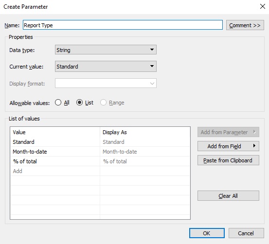
Parameters are great for adding additional functionality to dashboards. As a general rule you should try and make your dashboard as user-friendly as possible. I like to build "toolbox" type visuals which make it easy for users to answer a wide range of questions with minimal effort.
Create any required dynamic selector fields
Dynamic selector fields are calculated fields which include parameters. The idea behind these calculated fields is to change a value based on the option selected in a parameter.
Let's look at an example.
Let's say we have the parameter shown below. This parameter will allow the user to switch the date grouping of a certain view based on the option selected in the parameter.
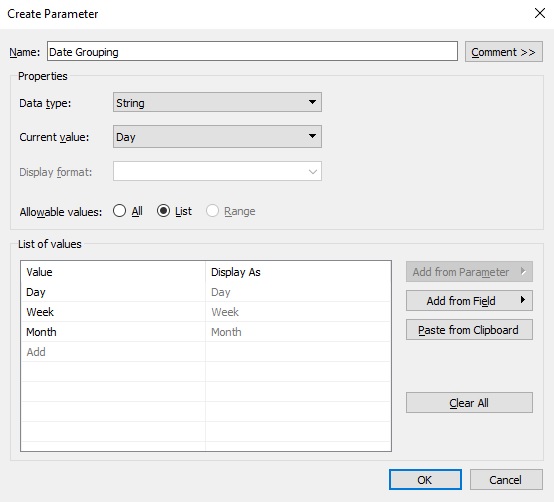
In order to leverage this parameter in my data viz I'll need to create a calculated field which uses the parameter in its' logic.
My calculated field would look something like the formula below:
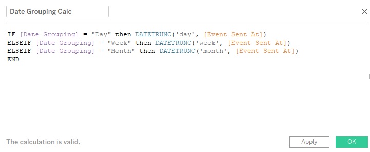
In this formula I'm using the IF function to change the date grouping based on the current value in the parameter.
You can be very creative when you combine parameters and calculated fields. Once you master these two types of fields in Tableau an entire world of possibilities opens up to you.
Build your visualizations
Now that you have all the fields you need you can get started building your visualizations.
Tableau has 24 unique data visualization types. The most commonly used visualization types include:
- Tables
- Line graphs
- Bar graphs
- Pie chart
- Area chart
- Scatter plot
- Treemaps
- Maps
To start building your viz simply drag relevant dimension fields onto the columns and rows sections. This will give you a pivot-like table, similar to a pivot table in Excel.
The last step is to drag a measure onto the marks section and to select a calculation (sum, count, distinct count, etc).
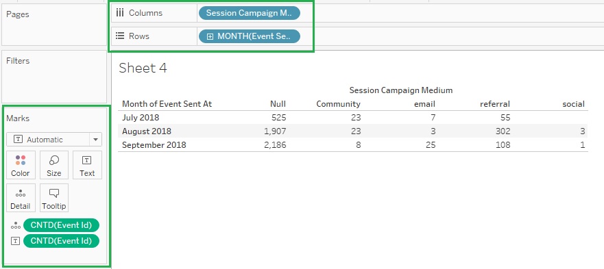
To switch the type of visualization click on the "Show Me" button in the top right hand corner of the screen and select a viz type.
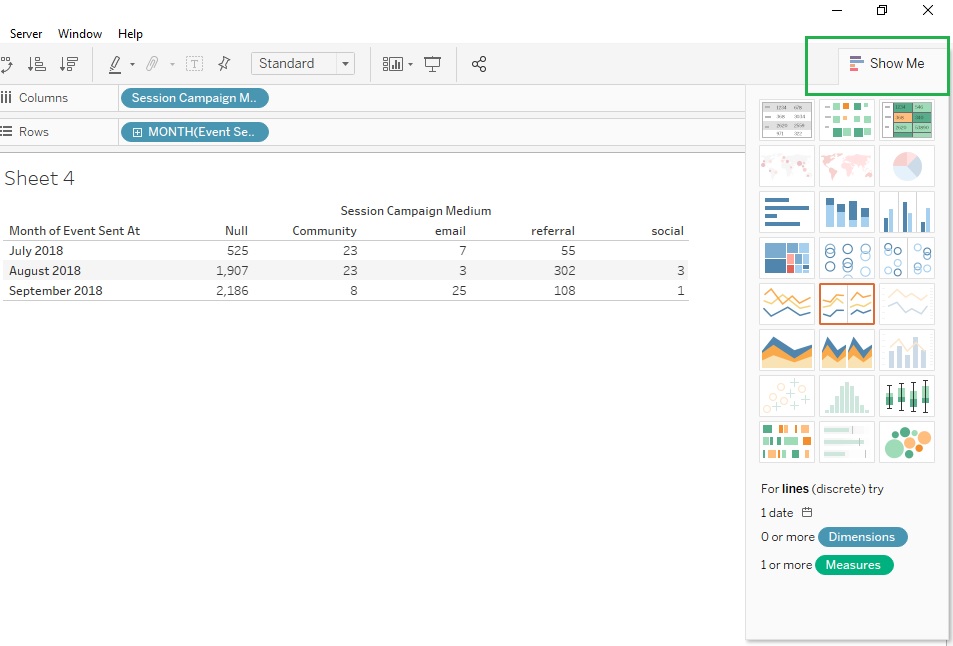
It can be a bit tricky to go from a table to other types of visualization. Take your time and try and understand what each viz type requires in terms of dimensions and measures.
Build your dashboard
After building a number of visualizations in separate sheets you'll want to bring everything together. To do this you'll use a different type of sheet, either a dashboard or a story.
A dashboard is a container of sheets and allows you to place multiple sheets in a single view. A story is a container that holds sheets or dashboards in a series, similar to how PowerPoint has slides.
To create a dashboard click on the dashboard menu at the top of the screen and select "New Dashboard".
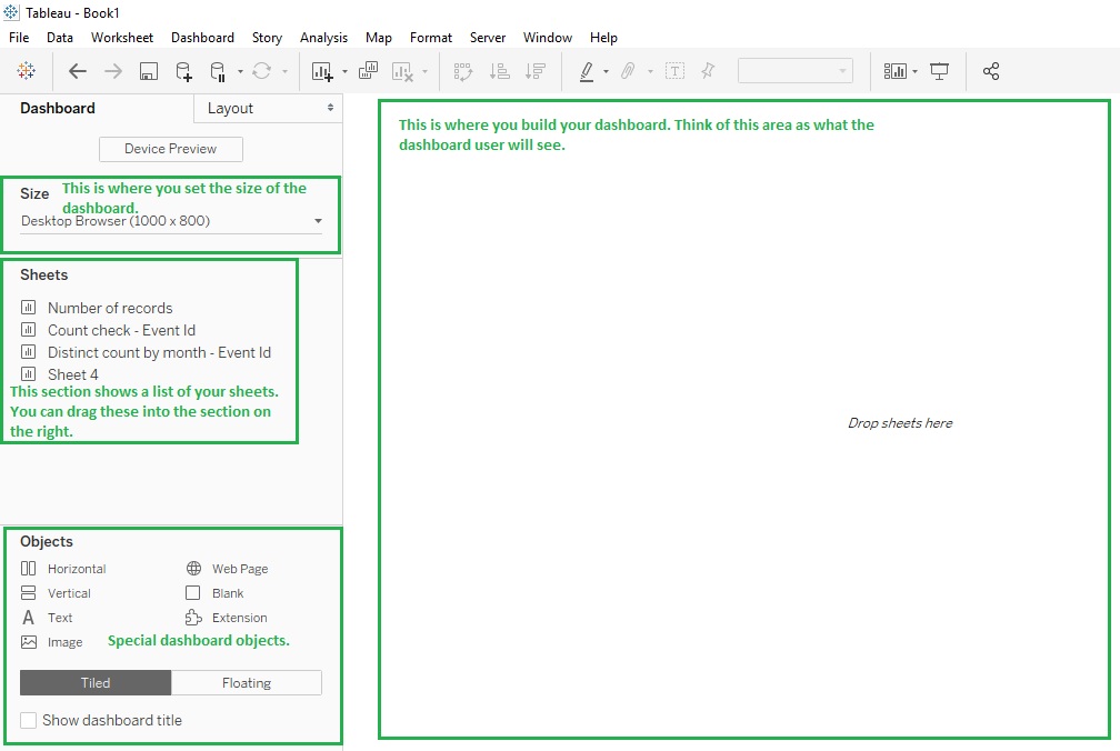
The dashboard has 4 main sections that you need to be familiar with.
The first is the size setting.
As a general rule you'll want to either go with the default setting or the automatic setting. The advantage of automatic is that it will force the dashboard to resize based on the resolution of the screen showing the dashboard. The disadvantage is that this slows the loading time of the dashboard.
The default view will fit nicely for most resolutions and should be the one you use most often, unless you get a lot of complaints.
The next section is the sheets list. This section is similar to the dimensions and measures screens we've come across earlier in this post. You can simply drag the relevant sheets onto the section in the middle and start building your dashboard.
Note that each time you add a new sheet to the section in the middle, all the legends, and filters shown in the sheet will be added to the view. You'll want to remove any unnecessary elements which get added to the dashboard.
The last section is the objects section in the bottom left hand corner. This section holds special objects which can be used in the dashboard. These include containers (vertical, horizontal and blank) which are critical for building the layout of the dashboard. Image and text containers are useful for adding additional content to the dashboard.
Keep in mind that building out the layout of your dashboard can be tricky.
Depending on the scope of your project, and the number of data vizs, you might want to consider putting everything into a Story.
Style your sheets and dashboard
We're almost at the end of our project but before we can hand it over to our consumers we need to beautify our dashboard.
Tableau has put a ton of effort into making as many elements of your visuals customizable. You can change all your fonts, borders, alignment and many other design aspects quickly and easily.
QA your dashboard
Your dashboard is now ready to be published and shared with your consumers.
Before you jump the gun spend some time using the dashboard. I'd also suggest getting someone who hasn't yet seen the dashboard to give it some love.
The goal is to try and identify any issues before you ship it. Your consumers will expect to be able to use the dashboard for decision making purposes once they get their hands on it. Limit any fallout by letting them know that since the dashboard is new, there still might be some minor issues with it.
Below is a checklist of things to go over before you publish your dashboard:
- Do all your visuals load?
- Do all your filters work?
- Do all your parameters affect your visuals?
- Is there consistency in your design?
- Do the numbers make sense?
- Do your tooltips add value?
- Are your titles and labels easy to understand?
- Are there any spelling mistakes?
- How does the dashboard look at full screen?
Once you've gone through this list and everything looks great, you can move onto the last step in the process, publishing your dashboard.
How to publish your Tableau dashboard to Tableau Online or Tableau Server
To publish your dashboard to the cloud, you'll need to click on "Server" in the top menu and then on "Publish Workbook...".
On the next screen you'll select either Tableau Online or Tableau Server and log in.
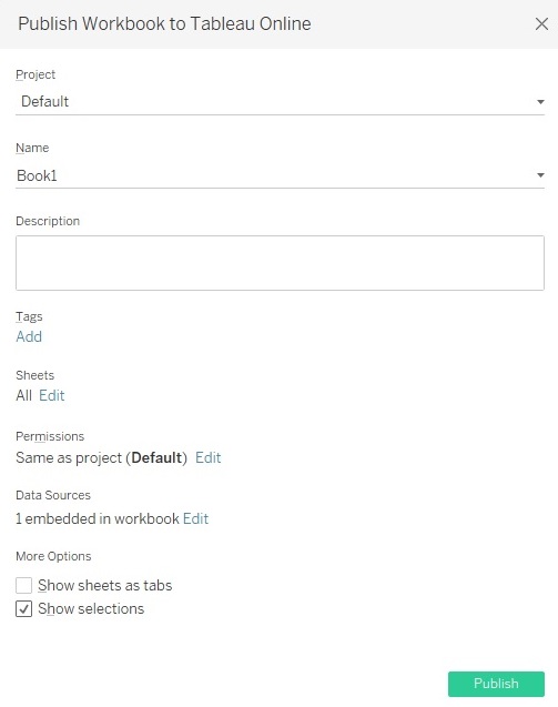
Once you've logged in, a window with a bunch of options will appear. Below is a list of these options and what each one means.
- Project - The name of the folder where the workbook file will be hosted. You can customize these in your Tableau Online or Tableau Server admin area.
- Name - The name of the workbook.
- Description - A place for you to add a description to your workbook. This description will be visible to anyone who has access to the workbook.
- Tags - You can add tags to your workbook to help you find it via search.
- Sheets - Which sheets should be visible.
- Permissions - The permissions that are needed to view the workbook.
- Data Sources - This section will list all the data sources used in the workbook. You'll need to go through each and set the relevant authentication option.
- More Options - This allows you to change the structure of the dashboard.
Note that every sheet you create in the workbook will be published to the cloud. Only the sheets checked in the sheets drop down menu will be visible when the workbook is loaded in Tableau Online or Tableau Server.
That's it, congrats on finishing your first Tableau dashboard.
Summary
Tableau is an amazing company with best-in-class products. I've used Tableau for a few years now and actively promote it to my clients.
I estimate that it will take the average analyst roughly 100 hours to learn Tableau to the point where they feel confident with the tool. Thankfully you can download Tableau Desktop for free and use it without any limits for 14 days.
There are a number of great courses and free training resources that can help you start building awesome dashboards in no time.
I hope this guide has helped you get a basic idea of what Tableau is all about. If you have any questions on Tableau, feel free to comment below and I'll do my best to answer you.
Thanks for reading.


